Yeah I see that was a troll statement but I guess you don't have any experience with the latest Intense frames. I have worked on a few and there haven't been any issues.
I think you missed the point, the graphics look too big for the frame, like somebody ordered them too big.. the crc graphics on the intenses never bothered me.
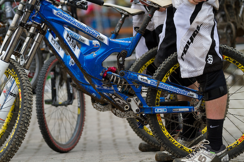
I can't put my finger on it but there is something off about that frame. For some reason my brain doesn't say DH bike when I look at it. Maybe I'm high?
I can't put my finger on it but there is something off about that frame. For some reason my brain doesn't say DH bike when I look at it. Maybe I'm high?
Like I mentioned it looks like an am frame. Looks like it would snap faster then an old 951
The graphics look horrible, the frame looks to thin and noodly for them
I can't put my finger on it but there is something off about that frame. For some reason my brain doesn't say DH bike when I look at it. Maybe I'm high?
think its the proportions, it looks kinda short n tall imo (front end like one of the LaPierre AM bikes?). Guessing it's nicer in real life.
captainspauldin, they had to share sticker space with Intense before though. Makes sense to me that they're going for maximum advertising space to get the remaining 0.001% of the worlds mtbing population
id agree that the stickers are off and i dont see why they dont give more space to nukeproof seen as its there own brand and crc is almost a household name in biking. So its not like they need more advertising. Seen as many IBDs are now stockists of nukeproof parts and frames that they'd give a bit more space to the nukeproof branding on the frame.
As for the frame itsself its not that weedy in person the pics dont do it justice. It looks much better in the raw than the crc blue.
This site uses cookies to help personalise content, tailor your experience and to keep you logged in if you register.
By continuing to use this site, you are consenting to our use of cookies.


")