Quantcast

Print ad set

blue

boob hater
Jan 24, 2004
10,160
2
california
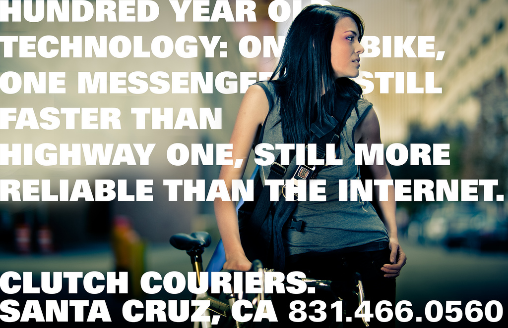
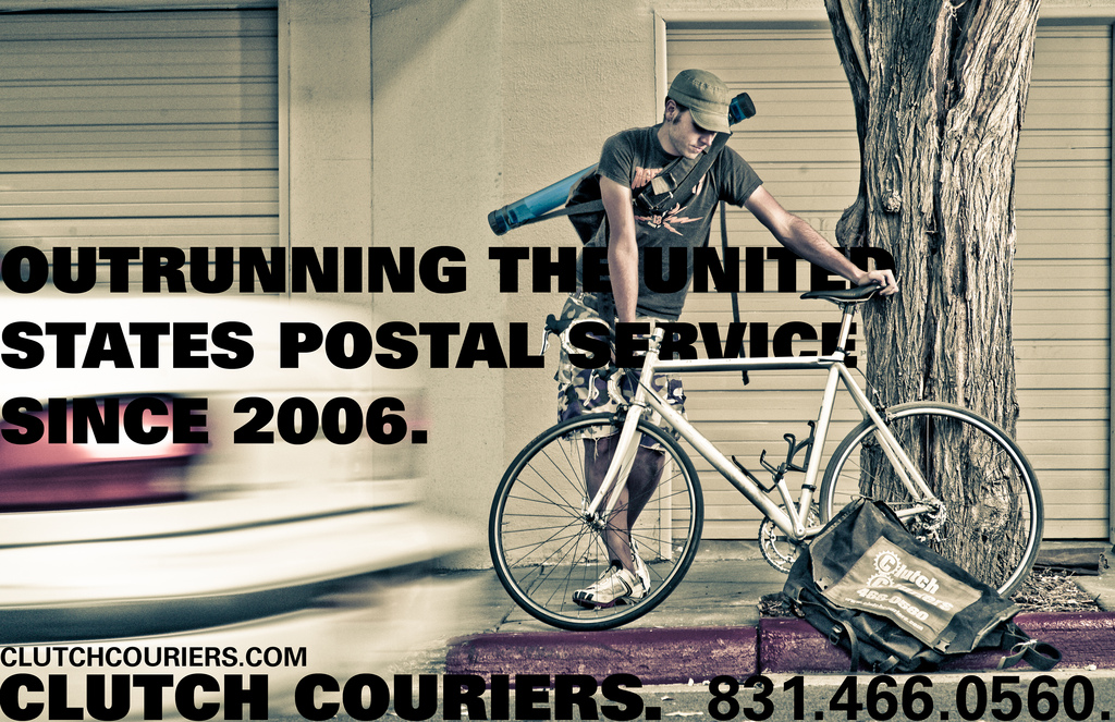
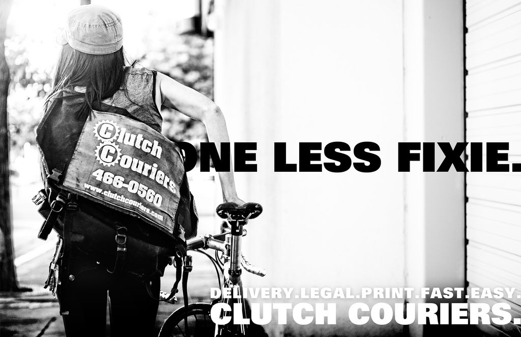
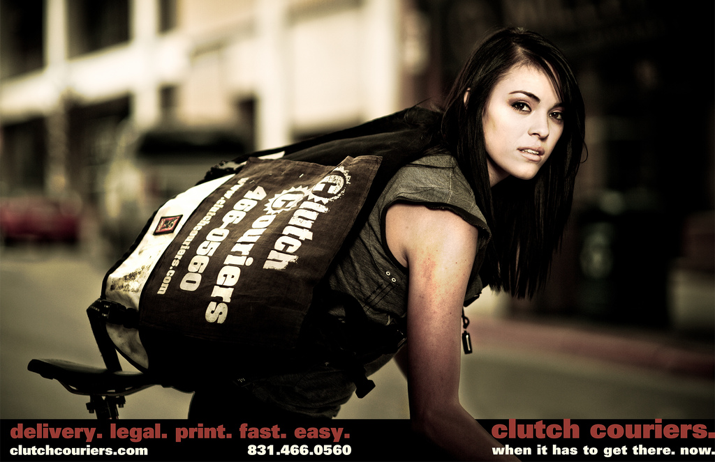
First client from a new joint venture. Photos/copy/design are all us for print distro.

Your thoughts?


Last edited:

narlus

Eastcoast Softcore
Staff member
Nov 7, 2001
24,658
63
behind the viewfinder
i like the 'one less fixie' the best, but i'm sure potential clients either don't know or care about fixies.

#2 seems to be showing quite the cleavage for a bike messenger.


#3 would work better had a postal truck or postman been in the frame as well, and the guy not looking down like he's defeated.

just my two cents.

i do like the post-processing...i've been doing a bit of desat/high contrast look lately.
 

Silver

find me a tampon
Jul 20, 2002
10,840
1
Orange County, CA
#3 would work better had a postal truck or postman been in the frame as well, and the guy not looking down like he's defeated.
Isn't that Blue? Look at the shoes...

I don't like not being able to read all the ad copy. I like the concept, but I don't think it works here. Try the copy from the last one on the right hand side of the one less fixie one (see Narlus for the reasons on that one.)

Was any of the post started off with a LR preset?

Is she actually a rider? She holds onto the bars funny.
 

blue

boob hater
Jan 24, 2004
10,160
2
california
i like the 'one less fixie' the best, but i'm sure potential clients either don't know or care about fixies.

#2 seems to be showing quite the cleavage for a bike messenger.


#3 would work better had a postal truck or postman been in the frame as well, and the guy not looking down like he's defeated.

just my two cents.

i do like the post-processing...i've been doing a bit of desat/high contrast look lately.
ARE YOU WHINING ABOUT BOOBS?! Nah, kind of agree.

The client it was done for has an anti-fixie bent...decided to roll with it. He was super excited about that one.

I agree on the third one. I wasn't actually posing, but we used it anyway.

Isn't that Blue? Look at the shoes...

I don't like not being able to read all the ad copy. I like the concept, but I don't think it works here. Try the copy from the last one on the right hand side of the one less fixie one (see Narlus for the reasons on that one.)

Was any of the post started off with a LR preset?

Is she actually a rider? She holds onto the bars funny.
Yep. It's me. I'll take your thoughts on the copy into consideration. I think that in certain shots it could be done without, but we wanted to keep a level of conformity across the board.

And no, she doesn't ride.

oh yeah, and do some proof-reading...in the last one, i don't think you want 'conformed' do you?
That's correct spelling. Conformed=legalese for filestamped copy that conforms to the courts guidelines. Client wanted something that would work on a postcard to drop at legal firms.
 

Damo

Short One Marshmallow
Sep 7, 2006
4,603
27
French Alps
I know jack sht about this sort of thing, but here's my 2c:


I like it but for a couple things: Decide if the lettering is behind or in front of the bike. It looks messy. Also a stationary rider with a discarded satchel representing fast service?... However, I do like this one.


Easily my favourite one. Simple and effective. And she's hot.

The rest seem either too cluttered/chaotic or too much like a model shoot.

There y'go. My unedumicated feedback as was begged for.


Edit:

I actually really like this one. Perfect image for the marketing, just don't like the wording.
 
Last edited:

narlus

Eastcoast Softcore
Staff member
Nov 7, 2001
24,658
63
behind the viewfinder
That's correct spelling. Conformed=legalese for filestamped copy that conforms to the courts guidelines. Client wanted something that would work on a postcard to drop at legal firms.
got it. i was thinking you wanted 'confirmed' as in confirmed delivery.