Quantcast

Help Me w/ a "Look"

bitingback

Turbo Monkey
So as much graphic design i do for other people...i STRUGGLE to pull a look for myself. i'm trying to design a logo for my massage business...and then subsequent marketing materials. after several ideas passing in and out of my head...i really like the idea of using the yin yang symbol to target through imagery the two types of clients i'm trying to target. not sure if this is working or not though.

basically i want to be able to target both the relaxation type of client as well as the athlete/fitness client. any ideas? i've been toying with doing a double sided business card which i can then be specific on each side to each target audience. however as a logo...i need something that will work for both.

here's what i've got so far...i'm still futzin with the fonts for the name as well.


Toshi

Harbinger of Doom
Oct 23, 2001
38,319
7,744
i didn't notice the dude, either. vertical spacing seems off, but i can't decide whether there are too many elements as quo fan suggests or too much white space. my first impression was the latter.
 

BurlyShirley

Rex Grossman Will Rise Again
Jul 4, 2002
19,180
17
TN
I am a man, and here is what would make me want to go get a massage:

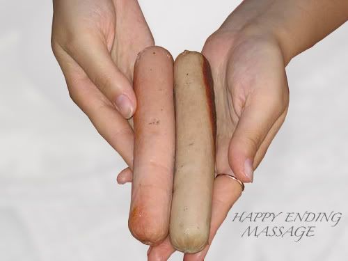
You could still call it "Intuitive Touch" if you want, but how about making the font out of strips of bacon? No? Bacon is played out? What about sausage links then?
And maybe replace that Yin Yang with a skull with a knife in it and a rattle snake crawling out one of the eye holes.
And then, the background on which all this stuff would be laid could look like a football field, or maybe a "no-mans land" from WWI with a bunch of dead germans hanging in concertina wire. Make sure they have those pointy helmets though.
 
Last edited:

stinkyboy

Plastic Santa
Jan 6, 2005
15,187
1
¡Phoenix!


I say that it's pure garbage. Cheesy type and some stylized flowers topped with a Photochopped yin yang thing with a couple random photos laid on another random graphic... What the hell is going on?

Research high end resort/spa logos for the goodness.

Also, there is tons of crap here too, but there are some good designers that will offer opinions on that "logo".
 

Streamline

Spammer Extraordinaire
Jul 9, 2007
333
0
The Intuitive font looks to Windows standard font and old time night club. I love the logo at first glance though. It is very feminine as is the name itself. As for going for male clients, I hate to say it but good luck. Most guys don't go for the message and pampering thing.
If you took to logo to a more modern look I think you could get the attention of both groups. Or you could have two separate names one for the feminine side and one for the male.
It is hard because being pampered has always been a feminine thing so your fighting history. I hope some of this helps.
 

bitingback

Turbo Monkey


I say that it's pure garbage. Cheesy type and some stylized flowers topped with a Photochopped yin yang thing with a couple random photos laid on another random graphic... What the hell is going on?

Research high end resort/spa logos for the goodness.

Also, there is tons of crap here too, but there are some good designers that will offer opinions on that "logo".
can always count on you for some great constructive criticism. good thing art is subjective.

I HAVE researched high end resort/spas and if i was trying to go that route i'd not be struggling. my struggle comes from trying to target both spa type clientele as well as the athlete/fitness clientelle. they are very seperate audiences which is what brought me to the yin yang thing.

The Intuitive font looks to Windows standard font and old time night club. I love the logo at first glance though. It is very feminine as is the name itself. As for going for male clients, I hate to say it but good luck. Most guys don't go for the message and pampering thing.
If you took to logo to a more modern look I think you could get the attention of both groups. Or you could have two separate names one for the feminine side and one for the male.
It is hard because being pampered has always been a feminine thing so your fighting history. I hope some of this helps.
thanks...it does help. i think i'm going to mess around with something less image based and see what i can come up with. as well as perhaps another version of a single logo that can express the duality of the target audience i'm going after. in the end i may scrap the name and just go with my name and something more "medical" in nature.
 

X3pilot

Texans fan - LOL
Aug 13, 2007
5,860
1
SoMD
BB, some constructive thoughts and some smart assed remarks, just pre warning you:

I was serious when I said the yin-yang thing reminded me of a black and white cookie. But I'm a fat ass who likes cookies. Maybe some gray or other color?

Intuitive touch makes me thing you automatically know where I need to be touched, whatever, but if you have that much intuition, tell me the Powerball numbers, too.

The muscular man's chest coupled with flowers and candles screams gay to me, but I'm borderline homophob anyway...

What about some art with a athletic semi-naked chick riding a bike (in a slipstreamed, none naught bits showing type pose riding infront of a garden setting of someone getting a massage laid out on a table, sort of the resort massage scenes.


Or, go with the sausage and dead germans thing, but throw in some motocross or monster trucks..
 

bitingback

Turbo Monkey
BB, some constructive thoughts and some smart assed remarks, just pre warning you:

I was serious when I said the yin-yang thing reminded me of a black and white cookie. But I'm a fat ass who likes cookies. Maybe some gray or other color?

Intuitive touch makes me thing you automatically know where I need to be touched, whatever, but if you have that much intuition, tell me the Powerball numbers, too.

The muscular man's chest coupled with flowers and candles screams gay to me, but I'm borderline homophob anyway...

What about some art with a athletic semi-naked chick riding a bike (in a slipstreamed, none naught bits showing type pose riding infront of a garden setting of someone getting a massage laid out on a table, sort of the resort massage scenes.


Or, go with the sausage and dead germans thing, but throw in some motocross or monster trucks..

OMG...i nearly lost my beer on that one.!!!

fvck it...bacon and "cookies" it is. :cheers:
 

AngryMetalsmith

Business is good, thanks for asking
Jun 4, 2006
21,230
10,105
I have no idea where I am
Why not have two biz. cards? One with candles, flowers, bamboo and other girlie sh1t. And just a straight forward card with a simple logo and text for atheletes. Pampering = details, Athlete = get'r done.

As far as the design you have now, it's way too busy.


And if pork products are the way to go...


BurlyShirley

Rex Grossman Will Rise Again
Jul 4, 2002
19,180
17
TN
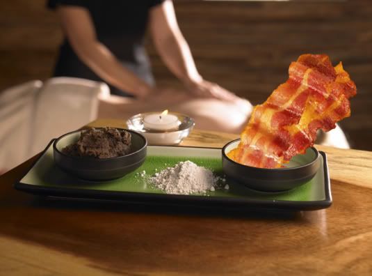
Is that a brownie, some cocaine and bacon? Holy crap that sounds like an awesome massage. Will you snort it off my loins?