Quantcast

New Ridemonkey T-Shirts

stinkyboy

Plastic Santa
Jan 6, 2005
15,187
1
¡Phoenix!
Our boy Dirty Dog has narrowed the shirt designs down to these two:


He wanted to see artwork switched around, suggested introducing navy blue or gray and instead of the logo, just using the monkey head.

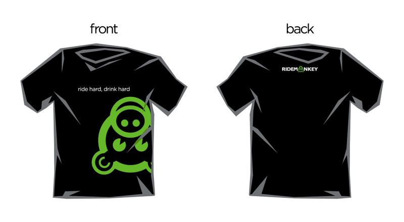
As a protector of brands, I feel the green/black/gray should not be deviated from and the full logo should always be there and the head used only as a secondary graphic. I think the evolution shirt is spot on, so I left it alone.

He respects what the monkeys want to adorn their bodies with, so suggestions are welcomed.

Oh yea, I'll redraw the wheel in the icons design to better reflect a MTB wheel and not a road wheel.
 

jimmydean

The Official Meat of Ridemonkey
Sep 10, 2001
41,251
13,374
Portland, OR
I would order both as long as they are not light colored shirts. I like the dark colors, awesome work Stinky.
 

stinkyboy

Plastic Santa
Jan 6, 2005
15,187
1
¡Phoenix!
Make it a disc rotor.
I thought about that too. It should be easily identifiable as: computer + biking = ridemonkey.

Actually that might be good as a rider will recognize a wavy or gothic rotor design.

Anyone else?


Edit: It should prolly be biking + computer = ridemonkey.
 

DirtyDog

Gang probed by the Golden Banana
Aug 2, 2005
6,598
0
I prefer the artwork on the back so I don't feel like a walking billboard.

I'd prefer to stick with single color graphics so that money can be spent on excellent quality shirts without raising the cost to the consumer Monkey.

Of course, these are just suggestions and you are encouraged to fling poo at me :D
 

H8R

Cranky Pants
Nov 10, 2004
13,959
35
Timeline?

I'm moving my shop, but I should be back up and running soon. (and I'm finally bike commute distance to it...)
 

binary visions

The voice of reason
Jun 13, 2002
22,101
1,153
NC
I like #1 and #3 (with the big logo). #2 doesn't do much for me.

Much prefer it with the two sided print as well... I really dig the simplicity of the evolution characters and the small logo on the back. I don't know what the cost difference is, though.
 

jacksonpt

Turbo Monkey
Jul 22, 2002
6,791
59
Vestal, NY
Love the evolution design. Not so crazy about the black shirt. I get the whole RM color thing, but black is just too damn hot in the summer.
 

H8R

Cranky Pants
Nov 10, 2004
13,959
35
Love the evolution design. Not so crazy about the black shirt. I get the whole RM color thing, but black is just too damn hot in the summer.
Evolution design ftw.

Silver, black or olive shirts. American Apparel? FOTL?


Lemme pull a quote together tonight, I'll send some PM's.
 

binary visions

The voice of reason
Jun 13, 2002
22,101
1,153
NC
Actually, I think the evolution design would look pretty sweet with the Ridemonkey logo small and on the edge of the sleeve.
 

jacksonpt

Turbo Monkey
Jul 22, 2002
6,791
59
Vestal, NY
Silver, black or olive shirts. American Apparel? FOTL?
Silver, most definitely (assuming you mean a light gray, not actually silver)
Black, would probably still buy one, but like I said...
Olive, not sure, could be cool assuming olive and not lime green

Personally, I don't care about brand, sizing/cut and material weight is never the same anyway...
 

BurlyShirley

Rex Grossman Will Rise Again
Jul 4, 2002
19,180
17
TN
Can we just go with a regular, round neck hole? That polygon thing really isn't my style.
 

pigboy

in a galaxy far, far away
shirt #1. while I understand the desire to keep the RM brand coherent via the color of the shirt I would love to get that in silver/grey instead of black. Hawaii has hotness all year long.

maybe RM needs 2 or 3 "official" color schemes? Blk/green, Silver/grn, Pink/Grn (for the mudhunnies)
 

DirtyDog

Gang probed by the Golden Banana
Aug 2, 2005
6,598
0
love the evolution one, but it does look like a ripoff of the CoRE logo (a hook suspension group I belong to)

i'd still rock it.
Which of course is a ripoff of a hundred other works using the same concept. Don't upset the artist now.....
 

mandown

Poopdeck Repost
Jun 1, 2004
20,281
7,812
Transylvania 90210
Your concept of artistic impetus is narrow at best.
your interpretation of the seriousness and depth of postings on the intraweb appears uptight at best.

...paging dr. giggles, sombody has a broken funnybone.


and now back to the issue at hand - when do we get our muddy paws on the evolution shirt? i'll pay the extra cost for the two sided printing; my demand for this product makes my wallet flexible on this issue.